Living standards in Australia have been pushed down more than in any comparable country over the last three years, the economy has been in a per capita recession for two years, and households are among the most indebted in the world.
Working-class households have it worse than the most quoted statistics suggest and have been left with little breathing space after decades of increasing net wealth transfers from employees to bosses.
The findings—drawn from Red Flag’s analysis of data from the Organisation for Economic Co-operation and Development, the Australian Bureau of Statistics and the Reserve Bank—paint a diabolical picture. The following charts tell the story.
Click here for an interactive version of the chart.
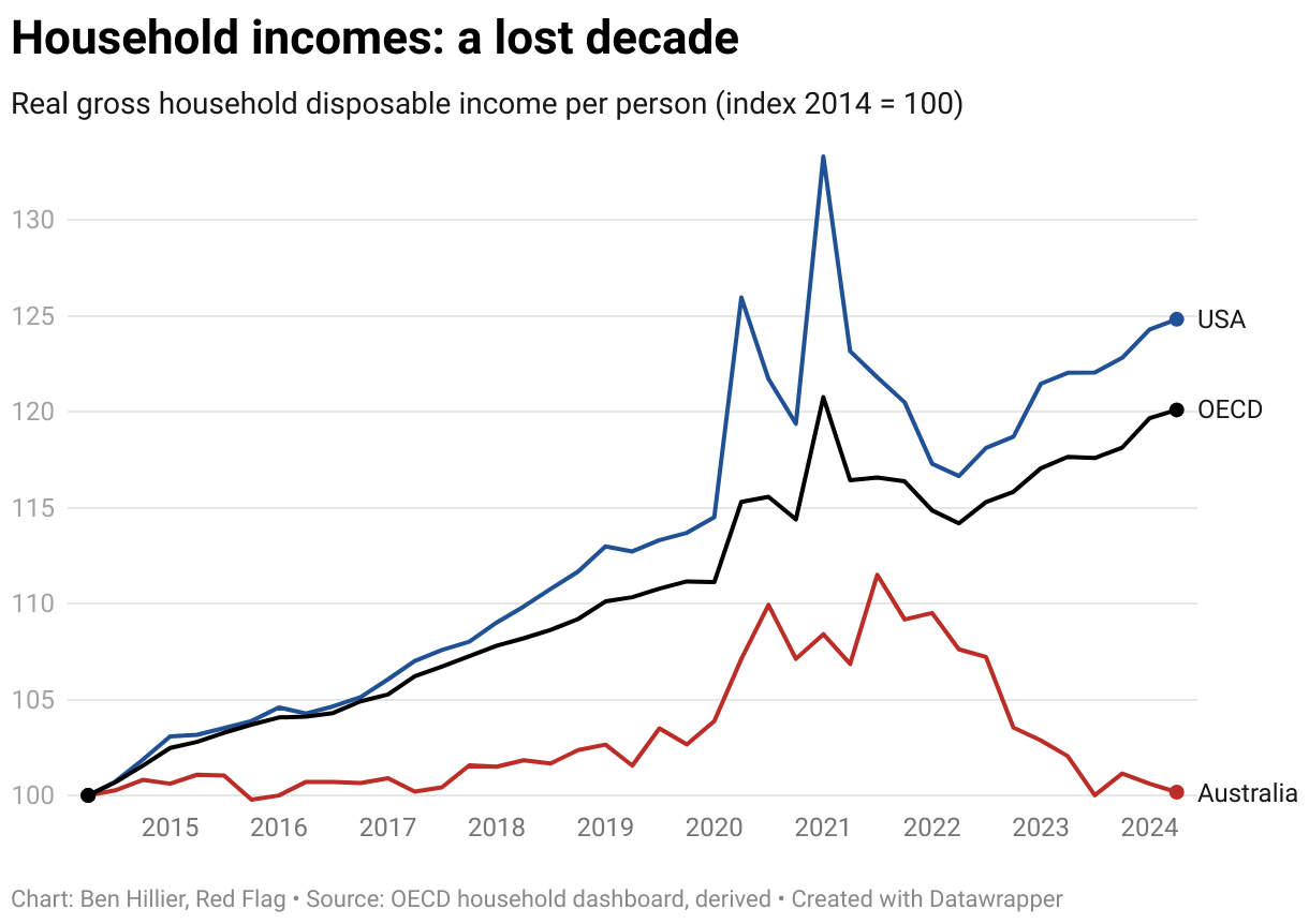
According to OECD data, wages have failed dismally to rise fast enough to compensate for consumer price rises, mortgage rate increases and a higher working-class tax burden. Real household disposable incomes are more than 10 percent lower than in 2021.
While that year’s high came from significant government subsidies and historically low interest rates during the worst phase of the global pandemic, incomes today are lower than before Covid-19 swept the world. In fact, they are not much higher than they were ten years ago.
“The impact on our living standards has been far greater than anywhere else. There is no argument that the fall is bigger than anything we have seen since 1959 [when the living standards’ index was started]”, economist Chris Richardson told the Australian newspaper last month.
“Real disposable income” measures the money left after inflation, taxes and mortgage payments are subtracted from wages. Household incomes across the rest of the OECD—sometimes called the club of rich countries—have, on average, increased solidly over the last two years. In the US, incomes are about 25 percent higher than in 2014.
For Australian workers, it’s been a lost decade.
Click here for an interactive version of the chart.
The decline in incomes has not been uniform. Households with more savings than debts have been able to increase spending because of higher interest rates. But households with high levels of debt and those with little savings have copped the worst of rising prices and rates.
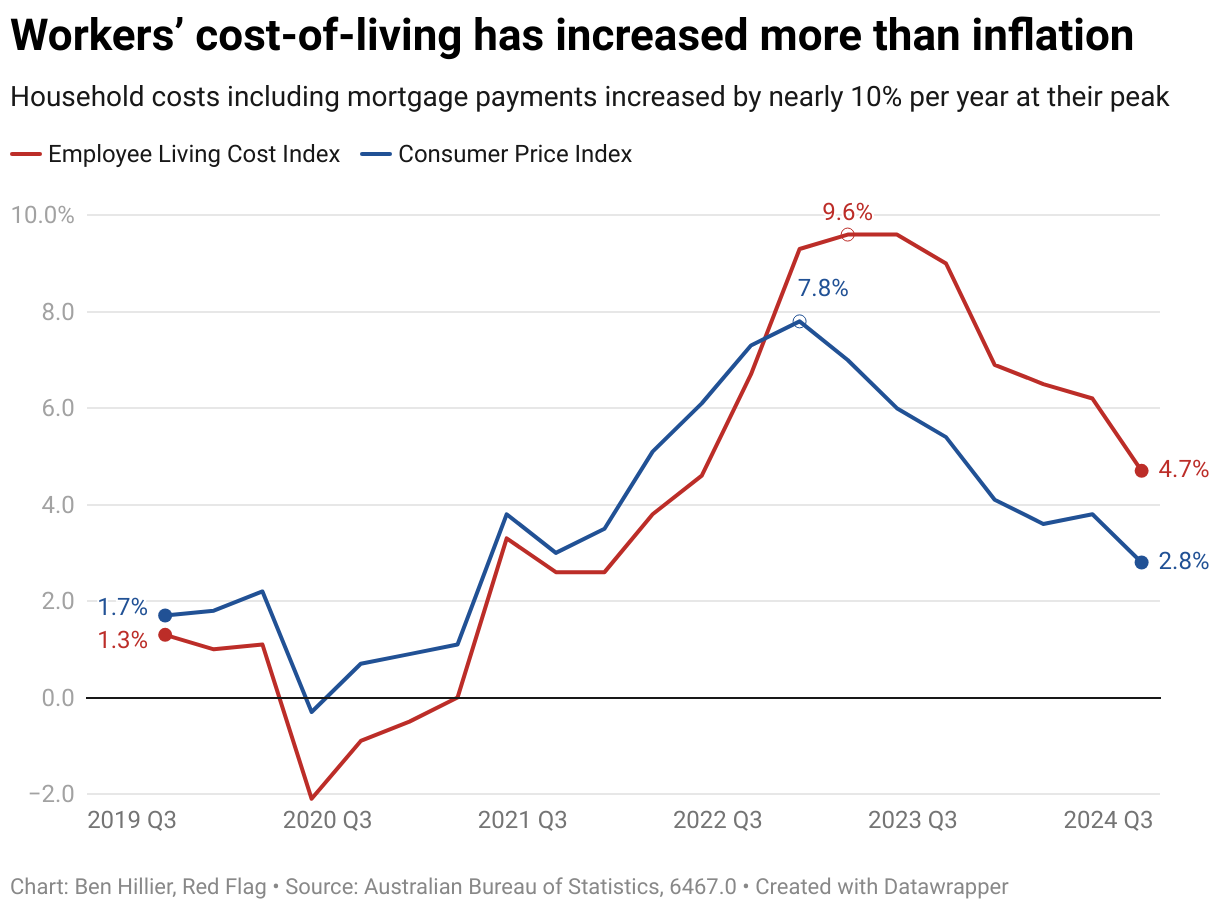
Economists, politicians and the media (Red Flag included) usually highlight the gap between wage growth and the consumer price index. However, the Bureau of Statistics has other measures of price inflation, the “cost of living indexes”, which measure the effects of rising prices and interest rates on different sections of the population.
Its employee living cost index has been running far higher than CPI inflation for more than two years, which helps to explain why household incomes have been destroyed so rapidly. While general inflation peaked at 7.8 percent in 2022, workers’ living costs climbed 9.6 percent per annum at their peak in 2023.
They increased by almost 2 percentage points above CPI inflation over the last year (to the start of October); they were 3.6 percentage points higher over the previous year.
Click here for an interactive version of the chart.
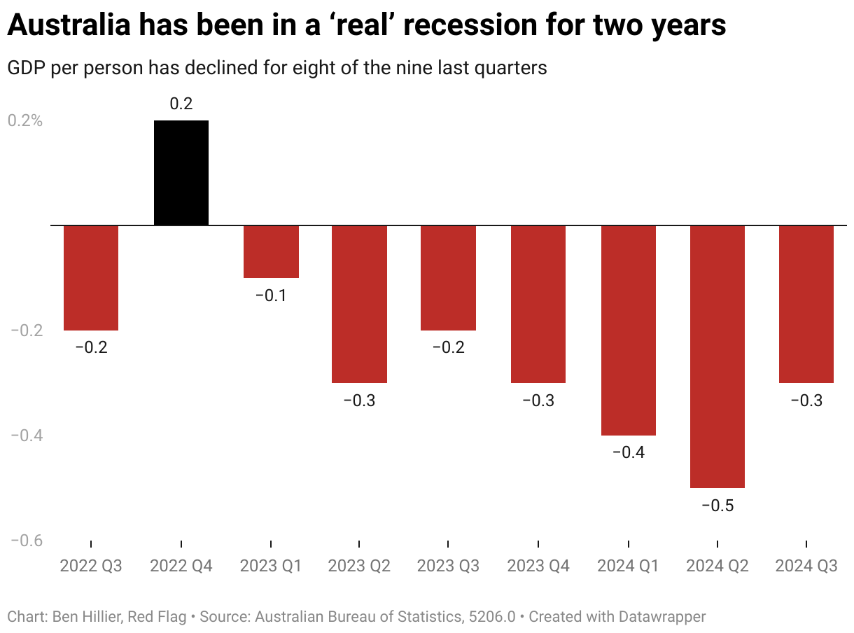
The Australian economy has continued to expand, albeit slowly, primarily because of government spending and high immigration. However, economic growth has been slower than population growth, meaning that output and income per person have been declining.
In fact, growth has gone backwards in eight of the last nine quarters, the most prolonged per capita recession in decades. “Over the past 44 years, when GDP has remained flat over the year, unemployment rises on average around 1.1 percentage points”, Guardian columnist Greg Jericho points out today.
The unemployment rate is currently 4.1 percent, up from 3.5 percent two years ago. It has been lower in just two of the past 50 years: 2008 and 1974. Which makes it all the more astounding that living standards have gone backwards so much. If people start losing their jobs in greater numbers, the economic pain will only be magnified.
Click here for an interactive version of the chart.
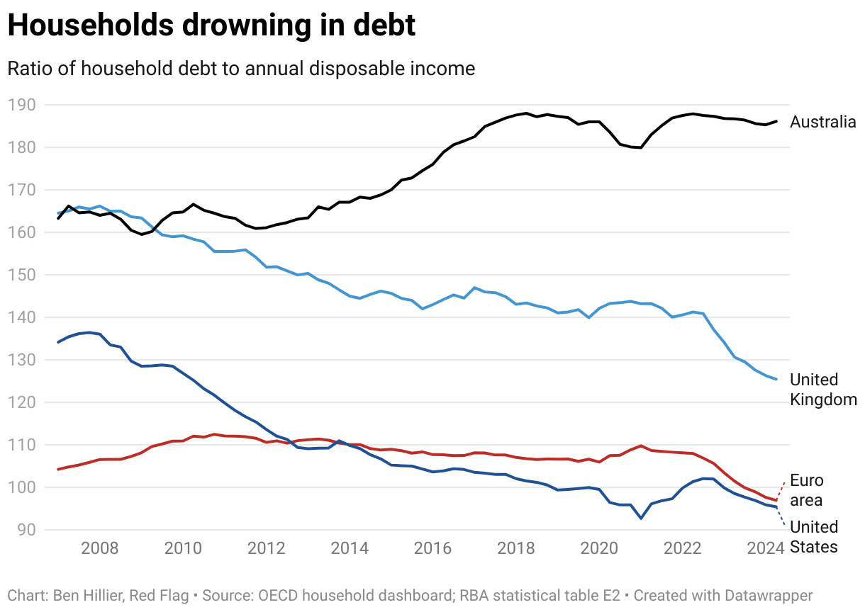
The more immediate issues noted above should be framed within two longer-term trends. First is the incredible build-up of household debt over several decades.
The ratio of household debt to annual income is 128 percent higher than 30 years ago. This primarily reflects out-of-this-world increases in property prices, which have climbed much faster than wages over the same period.
Australian households are among the most indebted in the world. But only one-third of households, primarily working class and middle class, are paying a mortgage. They bear most of the debt burden.
In contrast to the US, the UK and the Euro area, where debt levels have declined in the last decade, Australian working households have taken on increasing liabilities to secure a place to live. And with the interest rate on most housing loans changing in line with the Reserve Bank’s “cash rate” (its benchmark interest rate for lending between financial institutions), small movements on such large debts translate into significant changes in mortgage holders’ monthly interest payments.
No wonder the living cost index has climbed much faster than inflation.
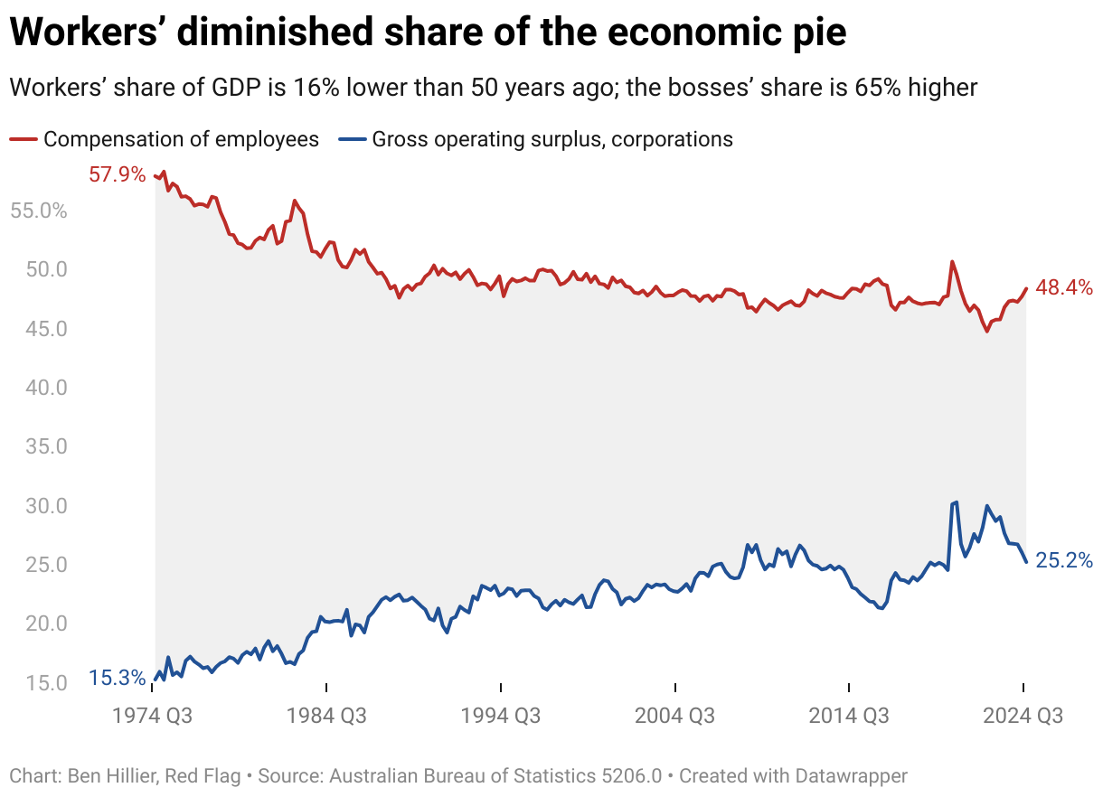
Click here for an interactive version of the chart.
A second long-term trend is the declining share of national income going to the working class. According to ABS figures, the share going to workers is 16 percent lower than 50 years ago; the bosses’ share is 65 percent higher.
The shifts have been expressed primarily in rising income and wealth inequality. For example, a recent Australia Institute research report, Wealth and inequality in Australia, estimated that the richest 20 percent of Australians own more than 63 percent of the wealth, while the poorest 20 percent own just 0.4 percent.
Wealth inequality measures not just the accumulation of riches in fewer hands but the relative decline of working-class economic resources, which resulted in the lack of a significant financial “buffer” for hard times like recent years.
Recovery?
While real incomes might finally be starting to rise for some groups, many working-class households could struggle to make up lost ground this side of 2030. It is still unclear when the Reserve Bank will begin cutting interest rates and where they will land once the cutting is complete.
It’s unclear how high unemployment will go, or when the per capita recession will end. Certainly, the huge debts will not be paid down anytime soon (they grew again in the last quarter). And to cap it off, wage growth is now slowing, which means any gains in real wages and incomes will be smaller.
It’s also not clear whether Australia will continue to avoid an absolute economic contraction, as it has, for the most part, for more than 30 years, unlike pretty much every other economy in the world. If that luck runs out, many people will end up pining for the current hard times, which might look like better times by comparison.


